
Rotgod's Art: Sonic degeneracy

Of all the artworks that have been created for Rotgod thus far, "Sonic degeneracy" is without a doubt the one with the most troubled, complicated history.
This disturbing, grotesque, deformed, cyborg-like monstrosity was born out of some sort of "vision" I had many years ago - and I thought this vision fell pretty much in line, on a conceptual level, with Rotgod's attitude, for which I had just started writing songs. At first, I thought I was going to use this cover idea for the "Organic machine" single, but then I realized it was such a strong, representative, quintessential concept that I could just use it for the full-length.
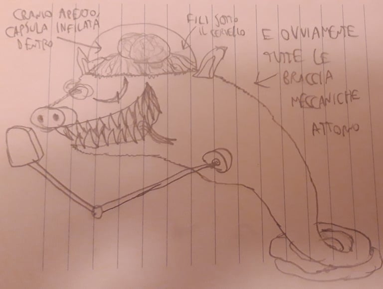
First sketch by Noise Maniakk
(2018, back when it still was supposed to be used as cover art for "Organic machine")
Thus, in early 2020 (around the time of the first lockdown), I reached out to Onìkarus (who, by the time, had already finished the artworks for "Before the impact..." and "Sybaritic metal"), giving him all the necessary sketches and tips to create such a complex, yet stimulating, interesting drawing.

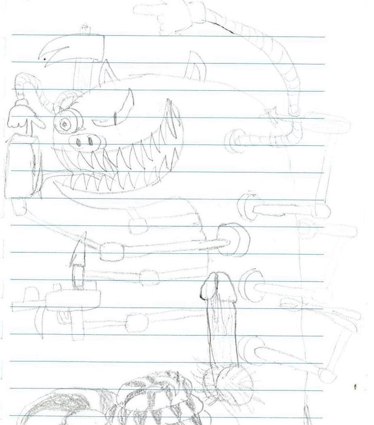
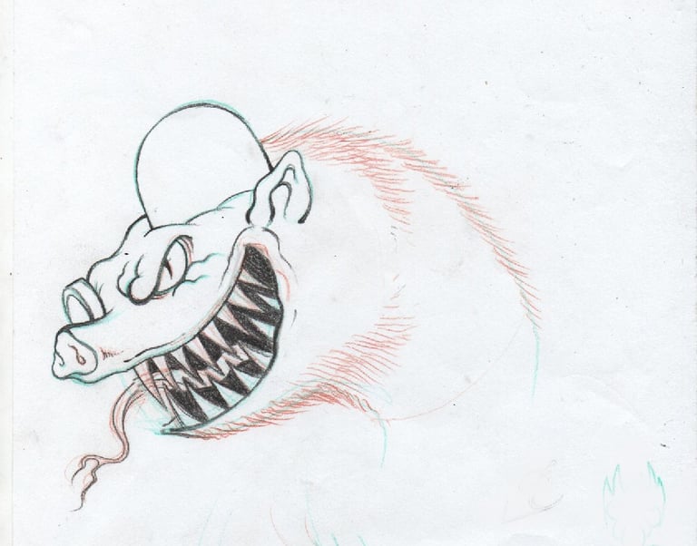
First sketch by Onìkarus (2020)
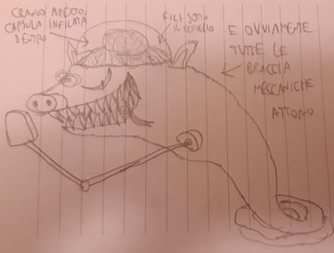
Second sketch by Noise Maniakk with tips about new details (2020)
We kept remaking the design for the monster over and over, adding more and more animal species to this "infernal hybrid" I had in mind (snake, pig, sewer rat, all put together in one horrid creature), in order to get the most disgusting, repulsive effect possible. Then, we added more details to emphasize the monster's "cyborg" component: aside from the bionic eye and the mechanical arms (which were already planned from the get-go), we even added an "artificial brain" (not the tech-dissodeath band, hah!) implanted through a capsule and connected to the skull through various electrical wires.
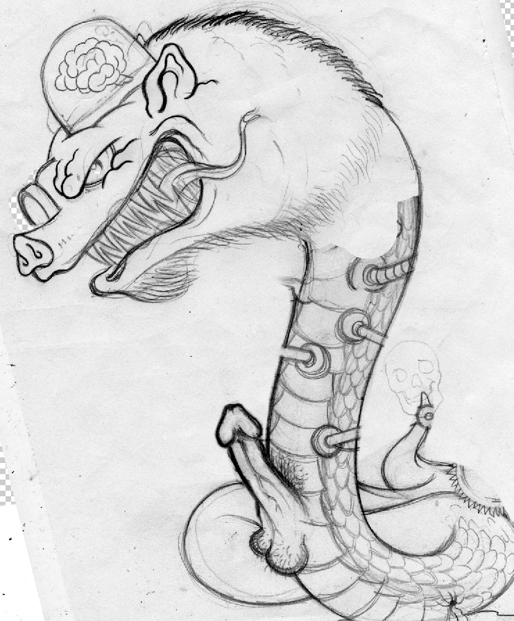
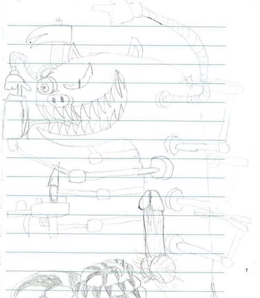
Second sketch by Onìkarus with new details added (2020)
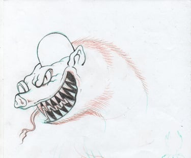
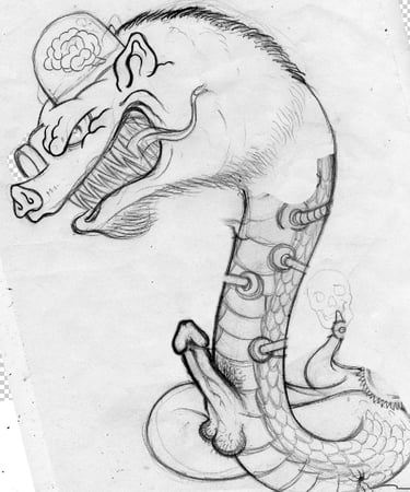
Head study by Onìkarus (2020)
We focused a lot on the posture as well (I wanted it to be more bent down, to emphasize the abject nature of this creature), and most importantly the face, to make it look as wicked and depraved as possible - at first using the guy's face from Anal Cunt's "It just gets worse" cover as a reference, and then expanding upon it, emphasizing some details down to maniacal levels (especially form and angle of the mouth, eye etc.). I was also very precise about the religious/ancestral symbols that had to be included down in the puddle of crap, to make the statement that Rotgod makes no concession to ANY form of religion or spirituality, from whichever corner of the globe it may come from.
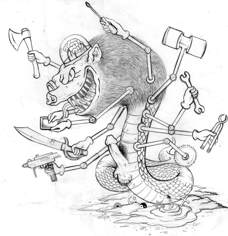

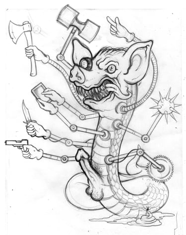
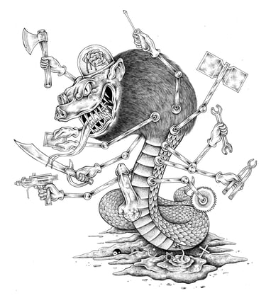
Final sketch (2020)

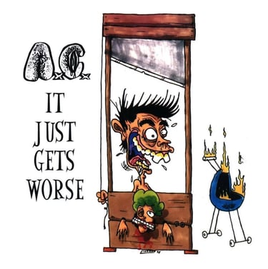
Cover art for Anal Cunt's "It just gets worse" (1999), used as reference for the monster's face
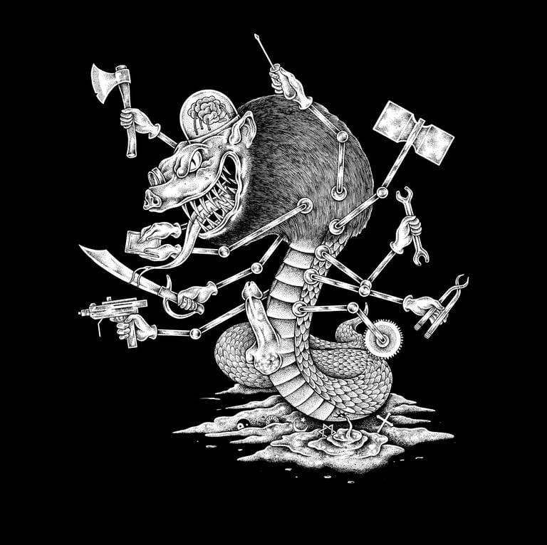
The final result can't leave you indifferent: whether positive or negative, the aim was to trigger a strong reaction in the beholder... and it can't be denied that Onìkarus truly outdid himself on here, creating one of his best works ever.
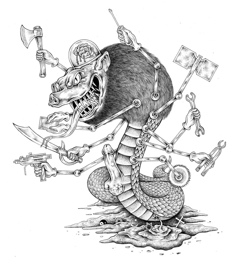
Finalized version (2020)
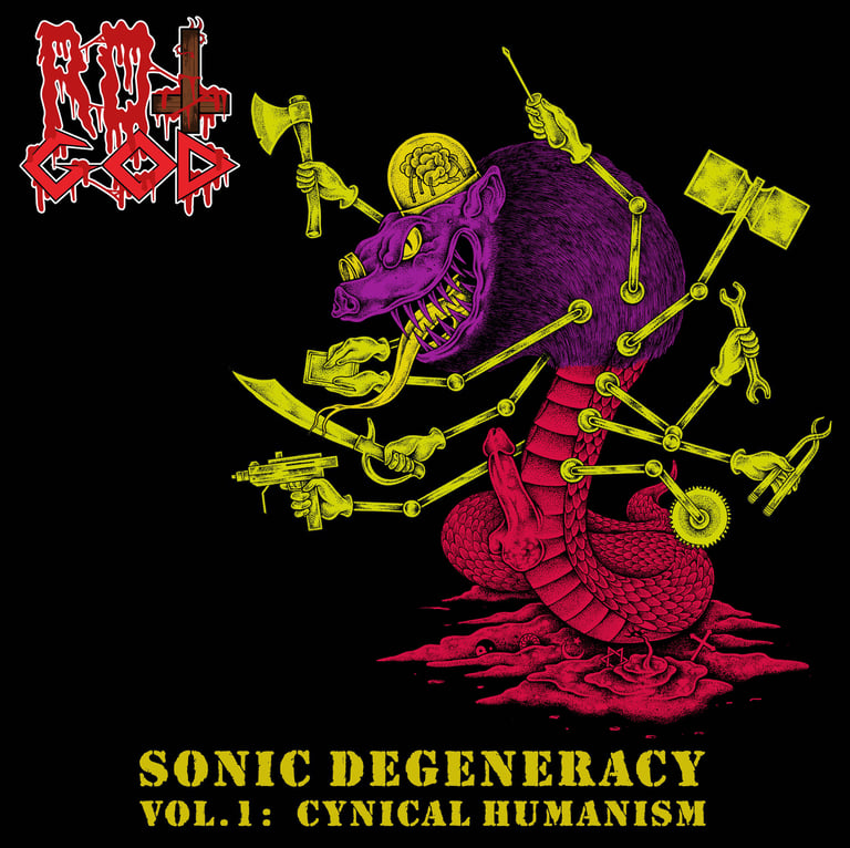
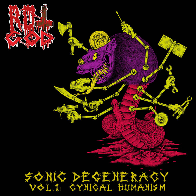
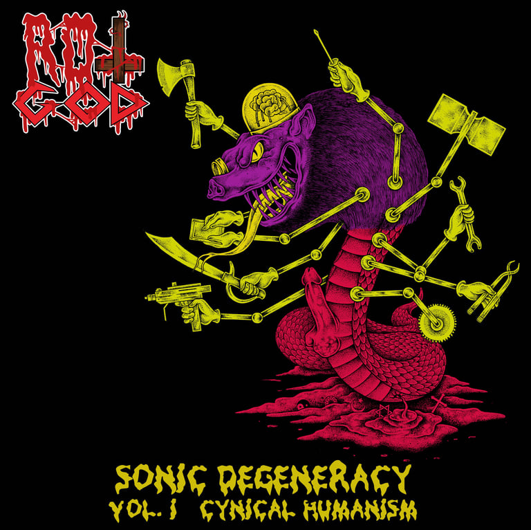
For the extended digital edition (divided in two parts), more studies were done on colors and title font, in order to emphasize the higher degree of "sickness" inherent to this particular version and enhance the differences between Vol. I and II both in terms of atmosphere and "personality". Preference went for bright, harsh, "sickly" color shades in stark contrast with one another - like purple against yellowish and reddish against light greenish - in order to get an "eyesore" effect that reflected the nature of those two records.
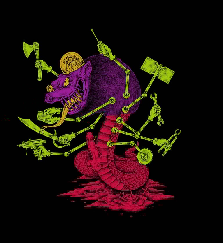

For the title, after various attempts, the choice went for a font that would look just as squashy, flaccid, sickly and repulsive - further emphasizing the difference between the album's standard edition (which instead presented a very rigid, hardcore-styled font) and the digital one.


Back to Articles.


Fast, raw, old school DEATH/THRASH/CORE for TRUE NOISE MANIAKKS ONLY!
Also be sure to check out: Eraser, Duskvoid, Spasticus, The Krushers, Dukov, Humanity Eclipse, Lutto, Dethroner, Destrypse