
Rotgod's Art: Logo
The first few Rotgod songs date back to spring/summer 2015; the moniker and the logo followed through within the span of a few months.
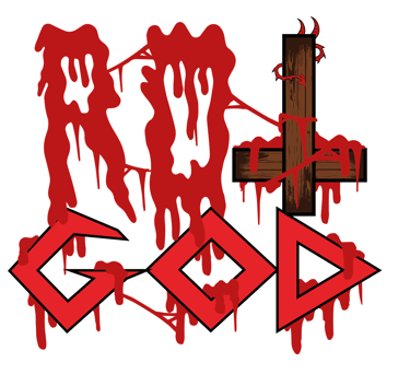
I drew the first sketch for the logo on my school desk, during my final high school year. Then in 2018, when I already was in the midst of recording the "Sonic degeneracy" album, I presented a somewhat "cleaned up" sketch to Onìkarus, who was instantly capable of giving it the visual impact it needed, halfway between "filthy" grind-style logo and "sharpened" thrash-style logo in the vein of Attomica - plus the usual anti-religious touch in the form of an inverted crucifix, from which you can see a tail and two horns emerging, reminding us of who's behind it all.
Fun fact: by looking at these sketches, you can notice a swarm of flies. In fact, an animated version of the logo was originally planned, with flies swarming all around it, but it was ultimately scrapped 'cause it was too difficult to nail properly and make it believable.
Original sketch, december 2015
"Cleaned up" sketch, september 2018
Definitive models by Onìkarus, october 2018
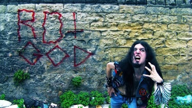
In 2024, for the two-part miniseries "Polemics and obscenity", the idea of putting a pentagram behind the logo (originally from my 2015 sketch) was revisited, using Onìkarus' black and white version of the logo in this particular case.
In 2025, for the "Raw is the law" EP, the logo was presented in a slightly "dirtied up" version by artist Claudio Elias Scialabba, who added more grain, roughness and filth to the original image in order for it to blend better with the EP's insanely raw, filthy artwork.
Back to Articles.
Still in 2025, for the artwork of the ultra-noisy single "Sadistic anti-musical sociopathy", the logo was redesigned from scratch by the mighty Elios Eatgrapes (Re-Turds, Psycopath Witch, Tragoidia...) in an "ultra-putrid" version, in the vein of a typical logo for an old school noisecore act. The end result gives a new meaning to the "raw" ideal this moniker has always been about.


Fast, raw, old school DEATH/THRASH/CORE for TRUE NOISE MANIAKKS ONLY!
Also be sure to check out: Eraser, Duskvoid, Spasticus, The Krushers, Dukov, Humanity Eclipse, Lutto, Dethroner, Destrypse